
How to Choose a Wedding Color Palette | Wezoree
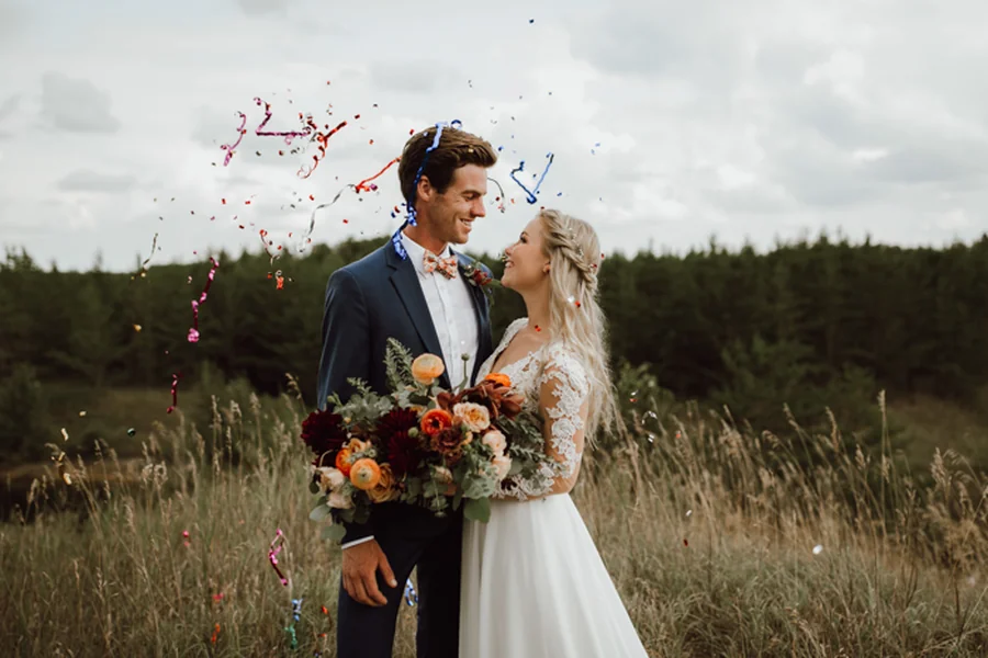
Color is the first decision a wedding makes about itself: before the venue is finalized, before the dress is chosen, before a single flower is ordered, the palette has already begun shaping every subsequent choice. It determines which florals will work, which fabrics will photograph well, which lighting will flatter the space, and which mood guests will register the moment they walk into the room.
For 2026 and into 2027, color has taken on even greater significance in wedding planning than in previous years. As couples move away from formulaic, trend-driven aesthetics toward more personal, intentional design, the color palette has become one of the clearest expressions of identity available in the entire planning process. A palette is harder to copy convincingly than a venue or a dress silhouette: it requires genuine taste and genuine decision-making, which is precisely why it has become a focal point of contemporary wedding design.
Visit Wezoree.com to discover the latest wedding color trends, gather inspiration from real celebrations, and connect with talented wedding professionals who can bring your vision to life. In this guide, we’ll explore how to choose a palette that complements your venue and season, along with practical tips for creating a cohesive wedding design that feels unmistakably your own.
Beyond Aesthetics: How Color Shapes the Wedding Experience
Color is not simply decorative. It functions on multiple levels simultaneously, shaping guest perception, photographic outcome, and the emotional register of the day itself.
Color And Mood
Warm tones (terracotta, amber, deep red, gold) tend to read as energetic, celebratory, and intimate. Cool tones (sage, slate blue, lavender, ice white) tend to read as calm, elegant, and contemplative. Neither register is inherently superior; the right choice depends on the emotional tone the couple wants the day to carry.
Color And Photography
Color palette decisions have a direct technical relationship to photographic outcome. Certain colors render more accurately and more flatteringly under specific lighting conditions than others. A palette built around warm, muted tones tends to photograph beautifully in golden hour and candlelight; a palette built around cool, high-contrast colors can read as flat or muddy in the same light conditions, while excelling under bright, even daylight.
Color And Guest Perception
Guests register color before they register most other design details: it is the first visual signal of the event’s tone. A palette that feels cohesive and intentional, even if unconventional, reads as considered and confident. A palette that feels scattered or arbitrary, even if each individual color is beautiful, reads as undecided.
Color And Venue Harmony
The most successful wedding palettes work with their setting rather than against it. A palette that ignores the venue’s architectural and natural color context (stone, foliage, light) fights its environment throughout the day. A palette that is informed by that context feels inevitable, as though it could not have been any other way.
Top Wedding Color Trends: Forecast for 2026–2027
The directions shaping luxury wedding color in this period reflect a broader move in interior and fashion design toward depth, texture, and tonal sophistication, away from flat, trend-driven palettes. The five directions defining 2026–2027:
| Direction | Core palette | Mood | Best suited for |
| Tonal earth | Terracotta, rust, ochre, deep olive | Warm, grounded, sophisticated | Mediterranean venues, autumn weddings, rustic-luxury settings |
| Botanical depth | Forest green, deep teal, moss, bottle green | Rich, organic, immersive | Garden and woodland venues, evening events |
| Modern monochrome | Black, ivory, charcoal, silver-grey | Architectural, graphic, refined | Contemporary venues, editorial photography focus |
| Soft saturation | Dusty rose, mauve, plum, wine | Romantic, layered, emotionally warm | Intimate dinners, candlelit receptions |
| Mineral cool | Slate blue, smoke grey, pale aqua, alabaster | Calm, elegant, contemplative | Coastal venues, daylight ceremonies |
Tonal Earth
Tonal earth has emerged as one of the most consistently requested directions across Mediterranean destination weddings. It works because it echoes the actual landscape (sun-baked stone, olive groves, terracotta rooftops) rather than imposing an unrelated color scheme.
Botanical Depth
Botanical depth marks a departure from the pale, airy palettes that dominated the previous decade. Deep greens paired with brass, dark wood, and warm candlelight produce an atmosphere that reads as luxurious, specifically because it is unafraid of saturation and shadow.
Modern Monochrome
Modern monochrome reflects the broader influence of architectural and editorial design sensibility on contemporary luxury weddings. Black as a primary wedding color, in stationery, florals, tablescapes, and even occasionally bridal fashion, has moved from provocative to genuinely mainstream at the design-forward end of the market.
Soft Saturation
Soft saturation represents an evolution of the blush-and-neutral palette that dominated for years, taking the same romantic register but committing to genuine color depth rather than washed-out pastels.
Mineral Cool
Mineral cool continues to perform well for coastal and daylight-focused weddings, offering sophistication without the warmth-dependency of earth tones: a palette that holds its integrity under bright, even Mediterranean or coastal light.
How to Choose a Palette That Matches Your Personality and Vision
The most successful wedding palettes are not chosen from a trend list: they emerge from a couple’s existing aesthetic instincts, then are refined using trend awareness as a reference point rather than a starting point. A practical process for palette selection:
Step 1: Audit Your Existing Aesthetic Preferences
Look at your home, your wardrobe, the restaurants and spaces you’re drawn to. The colors that appear consistently across these contexts, without any wedding-specific pressure, are more reliable indicators of your genuine palette than anything sourced from current trend content.
Step 2: Identify Your Emotional Register
Decide, before choosing specific colors, whether you want the day to feel warm and energetic, calm and contemplative, romantic and soft, or graphic and architectural. This emotional decision should precede the specific color choices, not follow them.
Step 3: Choose An Anchor Color, Then Build Around It
Rather than selecting four or five colors simultaneously, identify one anchor tone that represents the core of your palette, then select two or three supporting tones that complement it: one similar in temperature and one that provides contrast.
Step 4: Test The Palette Against Your Venue
A palette that looks coherent on a screen or a swatch board can clash with a venue’s existing color context: stone color, foliage, and interior finishes. Test your palette against actual photographs of your venue before finalizing.
Step 5: Consider Your Own Coloring And The Wedding Party’s
A palette should be flattering to the people wearing it, not just beautiful in the abstract. Skin tones, hair color, and the specific shades chosen for bridesmaids’ or groomsmen attire all interact with the broader palette.
Seasonal Color Strategies: Spring, Summer, Autumn & Winter Weddings
Season affects color in two distinct ways: the quality of natural light available, and the seasonal materials (flowers, foliage, fruit) genuinely available to support a given palette without high cost or compromise.
Spring
Spring light is typically soft, slightly cool, and increasingly bright as the season progresses. Palettes that lean toward fresh, slightly muted tones (pale green, soft yellow, dusty pink, lilac) suit both the light quality and the season’s floral abundance.
Summer
Summer light is the most intense and most unforgiving of the four seasons: bright, high-contrast, and capable of washing out pale or low-saturation palettes. Summer weddings benefit from either committing to vivid, saturated color (which holds its own under bright sun) or carefully designing for shade and golden hour timing if a more muted palette is preferred.
Autumn
Autumn is the season most naturally aligned with the tonal earth and botanical depth directions defined earlier in this guide. The warm, saturated light of early autumn afternoons makes this the most forgiving season for deep, warm palettes.
Winter
Winter weddings, particularly in candlelit indoor settings, support the deepest and most dramatic palettes of the year (burgundy, forest green, black, deep navy) because the low ambient light and reliance on warm artificial lighting flatter saturated, dark tones in a way that bright daylight does not.
Seasonal palette reference:
| Season | Light quality | Best-suited palette direction | Seasonal floral support |
| Spring | Soft, cool, brightening | Fresh pastels, soft saturation | Tulips, ranunculus, early peonies |
| Summer | Intense, high-contrast | Vivid saturation or shade-designed pastel | Garden roses, dahlias, zinnias |
| Autumn | Warm, golden, low-angle | Tonal earth, botanical depth | Dahlias, chrysanthemums, rich foliage |
| Winter | Low, candlelight-dependent | Mineral cool or deep saturation | Amaryllis, anemones, and evergreen foliage |
Venue, Lighting & Location: Factors That Influence Color Selection
The venue itself is the single most important practical constraint on color choice, and the factor most frequently underweighted in early palette planning.
Stone And Architectural Color
Mediterranean stone venues, common across Italy, Greece, and southern France, feature a warm, neutral base color that complements any palette placed against it. Cool-toned palettes can read as slightly discordant with warm limestone or sandstone; warm, earth-toned palettes tend to harmonize naturally.
Natural Light Direction And Quality
A venue with strong, direct afternoon sun requires different palette consideration than one with consistently soft, indirect light. Direct sun intensifies saturation and can wash out pale tones; indirect or filtered light (through trees, through architectural shade) tends to be more forgiving across a wider range of palettes.
Artificial Lighting Plans
Candlelight and warm artificial lighting shift the apparent color of any palette toward warmer tones. A palette that includes cool blues or true whites will appear warmer than intended under candlelight: this should be accounted for at the design stage, not discovered on the day.
Indoor Vs. Outdoor Consideration
Outdoor venues require palettes that maintain their integrity as natural light changes throughout the day. Indoor venues offer more lighting control but require attention to the existing color context of walls, flooring, and architectural finishes.
Real Wedding Inspiration: Color Combinations from the Field
Across the destination weddings documented within Wezoree’s editorial network, several palette combinations recur with notable consistency at the luxury tier, each tied closely to a specific regional or seasonal context.
Combinations seen across luxury destination weddings:
- Terracotta, olive, and warm ivory: consistently used across Tuscan and Puglian estate weddings, echoing the stone and landscape of the region
- Deep teal, brass, and candlelight ivory: a combination favored for evening receptions in historic indoor venues, particularly in chateaux and grand estate settings
- Dusty plum, sage, and aged gold: a romantic, layered direction used frequently in autumn garden weddings across France and the UK
- Charcoal, white, and a single saturated accent (often a deep red or cobalt): the modern monochrome direction applied at contemporary or architecturally distinctive venues
- Sun-bleached blue, white, and silver-grey: a coastal palette frequently seen in Greek island and Amalfi Coast weddings, designed to harmonize with the white architecture and intense sea light
These combinations are not formulas to copy directly; they are evidence of how palette decisions succeed when they respond to the genuine character of a place, a season, and a couple’s aesthetic instincts, rather than when they are imported from an unrelated context.
Common Color Palette Mistakes – and How to Avoid Them
Even a well-chosen palette can fall apart in execution. Here are the mistakes that show up most often, and how to steer around each one.
- Mistake 1: Choosing Too Many Colors. A palette with five or more colors at equal visual weight tends to read as cluttered rather than rich. Limit your primary palette to three or four tones, with one functioning as the clear anchor.
- Mistake 2: Ignoring The Venue’s Existing Color Context. A palette selected in isolation, without reference to the venue’s stone, foliage, or interior finishes, frequently clashes once installed in the actual space.
- Mistake 3: Not Testing The Palette Under The Actual Lighting Conditions Of The Event. Colors that look correct under bright daylight or on a screen can shift significantly under candlelight or golden hour. Test swatches and floral samples under the lighting conditions you’ll actually have.
- Mistake 4: Treating The Palette As Fixed Across Every Element. The most sophisticated palettes vary in intensity and application across different elements: bolder in the florals, more restrained in the stationery, present but subtle in the tableware, rather than applying the exact same saturation everywhere.
- Mistake 5: Choosing Colors Based On Trend Rather Than Personal Resonance. A palette that follows a current trend without a genuine personal connection to it tends to feel less authentic in execution, and trends date an event’s photographs more visibly than almost any other design decision.
- Mistake 6: Underestimating Seasonal Floral Availability. A palette built around colors with no genuine seasonal floral support (such as certain blues and true black) requires either floral dyeing, imported stock, or substitution, all of which affect cost and outcome. Confirm seasonal availability with your florist before finalizing a palette.
How Wezoree Helps Couples Discover Trends and Find Matching Vendors
Translating a color palette decision into an actual wedding requires vendors who can execute it with technical precision: florists who understand which varieties achieve specific tones, photographers whose editing style complements rather than distorts the palette, and stationers who can accurately translate a color direction into print.
Wezoree’s editorial ecosystem supports this translation in several ways. The platform’s Inspiration section covers design trends and color direction in an editorial format that provides context for why certain palettes work in certain settings, useful for couples developing a genuine understanding rather than simply collecting images. Vendor profiles, with verified portfolios, allow couples to assess whether a specific florist’s or photographer’s existing body of work demonstrates fluency with the palette direction they’re considering.
The Real Weddings section is particularly useful for palette research: documented events show how a specific color direction performs in real event conditions, under the venue’s actual lighting and with the seasonal florals available, rather than in an idealized editorial shoot. Finding a real wedding that matches your intended palette and destination gives a far more reliable preview than general inspiration imagery, along with a verified vendor team that can be evaluated for the specific technical execution required.
Practical Checklist: 7 Questions to Finalize Your Wedding Color Palette
Before locking in a final direction, run your palette through these seven questions.
- Does this palette reflect colors I’m genuinely drawn to, or only colors from current wedding trend content?
- Does it support the emotional register I want the day to carry?
- Have I tested it against actual photographs of my venue?
- Have I confirmed it holds up under the actual natural and artificial lighting conditions?
- Have I confirmed seasonal floral availability with my florist?
- Is it limited to three or four tones, with one clear anchor?
- Have I planned how its intensity will vary across florals, stationery, tableware, and attire?
The Future of Wedding Design: Emerging Color Directions
Looking beyond the immediate 2026–2027 forecast, several directions are gaining momentum at the editorial and design-forward end of the luxury wedding market and are likely to shape the years that follow.
- Looking beyond the immediate 2026–2027 forecast, several directions are gaining momentum at the editorial and design-forward end of the luxury wedding market and are likely to shape the years that follow.
- Increased confidence with black and near-black tones: moving from an occasional accent to a genuine primary palette choice, reflecting broader fashion and interior design influence on wedding aesthetics.
- Regionally specific natural palettes: an intensifying preference for colors that are drawn directly from a venue’s actual landscape (the specific stone color, the actual foliage, the regional light quality) rather than imported aesthetic trends, reinforcing the broader move toward authenticity in luxury wedding design.
- Tonal layering over color blocking: increasing sophistication in how palettes are applied, with subtle variation in shade and saturation within a single color family rather than flat blocks of distinct colors.
- Seasonal honesty: a continued movement away from forcing out-of-season floral colors through imports or dyeing, in favor of palettes that are built around genuine seasonal and regional availability from the outset.
Conclusion: Turn Inspiration into Reality with Wezoree
A wedding color palette succeeds when it does three things simultaneously: reflects something genuinely true about the couple choosing it, responds intelligently to the venue and season it will inhabit, and translates cleanly into the specific materials (florals, fabric, print, light) that will bring it into physical existence.
The trends outlined in this guide are not formulas to apply uniformly. They are a map of where design sensibility is currently moving, useful as a reference point for couples developing their own specific, personal direction rather than as a template to copy.
Wezoree’s editorial content, vendor profiles, and real wedding documentation are built to support exactly this kind of informed, intentional decision-making, connecting the trend awareness covered in this guide to the verified professionals whose technical skill will determine whether a beautiful color concept becomes a beautifully executed wedding day.