
Why Light Blue Wallpaper Creates Calm, Modern Interiors That Never Feel Outdated
Interior design trends change constantly. Some colors dominate for a year and disappear quickly. Others remain popular because they create spaces that feel timeless and comfortable. That is one reason light blue wallpaper continues showing up in modern homes, apartments, offices, and boutique spaces looking for a softer, cleaner aesthetic without feeling cold or boring.
Light blue feels calm immediately.
The color creates brightness without the harshness of plain white walls.
It also works across many different design styles, which makes it one of the safest wallpaper choices for long-term interiors.
Why Light Blue Became So Popular in Interior Design
People want homes that feel relaxing.
Modern interiors shifted heavily toward:
- Softer palettes
- Natural light
- Comfortable spaces
- Minimal visual stress
Light blue supports all of those goals.
The color reflects light well while still adding personality to a room.
Unlike darker shades, light blue keeps spaces feeling open and airy.
That matters in homes where people want rooms to feel:
- Larger
- Brighter
- Cleaner
- More peaceful
The color works especially well in spaces designed for relaxation.
Wallpaper Adds More Character Than Paint
Paint creates flat color coverage.
Wallpaper introduces:
- Texture
- Pattern
- Depth
- Visual movement
Even subtle wallpaper designs make rooms feel more finished.
Light blue wallpaper works especially well because it can stay soft and understated while still creating visual interest.
This becomes important in:
- Minimalist interiors
- Neutral rooms
- Modern apartments
- Open-concept homes
Wallpaper helps walls feel intentional instead of empty.
Bedrooms Benefit From Softer Colors
Bedrooms should feel calm and comfortable.
Bright or overly saturated colors can create too much stimulation.
Light blue creates a softer environment that supports relaxation and rest.
Many homeowners use light blue wallpaper:
- Behind beds
- On accent walls
- Across entire bedrooms
- In reading corners
The color pairs especially well with:
- White bedding
- Linen textures
- Natural wood furniture
- Soft lighting
These combinations create bedrooms that feel peaceful without looking plain.
Light Blue Reflects Natural Light Beautifully
Natural light changes how colors appear throughout the day.
Light blue responds especially well to sunlight.
Morning light often makes it appear:
- Airy
- Fresh
- Crisp
Evening light creates:
- Softer tones
- Warmer undertones
- More muted shades
This subtle variation keeps rooms feeling dynamic instead of flat.
Homes with large windows often benefit heavily from light blue walls because the color enhances brightness naturally.
Small Rooms Feel Larger With Light Blue
Dark colors can make compact spaces feel tighter.
Light blue does the opposite.
The color visually expands rooms by reflecting more light and reducing visual heaviness.
This works especially well in:
- Hallways
- Bathrooms
- Small bedrooms
- Apartments
- Home offices
People often choose light blue wallpaper specifically to make rooms feel more open.
Bathrooms Feel Cleaner and More Relaxing
Bathrooms often rely heavily on hard surfaces like:
- Tile
- Glass
- Mirrors
- Metal fixtures
These materials can make spaces feel cold or sterile.
Light blue wallpaper softens the room visually.
The color also connects naturally to:
- Water
- Sky tones
- Spa-inspired interiors
That association helps bathrooms feel more relaxing.
Many designers pair light blue wallpaper with:
- White vanities
- Matte black fixtures
- Marble countertops
- Brushed nickel accents
These combinations create balanced, modern bathrooms.
Coastal Design Increased the Popularity of Light Blue
Coastal-inspired interiors remain extremely popular.
Light blue became heavily associated with:
- Beach homes
- Ocean colors
- Airy interiors
- Relaxed living spaces
However, modern coastal design looks much cleaner than older nautical themes.
Today’s interiors avoid excessive decorations and instead focus on:
- Natural textures
- Soft palettes
- Open spaces
- Minimal clutter
Light blue wallpaper supports this aesthetic perfectly.
Home Offices Need Softer Design Elements
Remote work changed how people design home offices.
People now spend hours every day inside these spaces.
That increased demand for rooms that feel:
- Comfortable
- Focused
- Bright
- Professional
Light blue wallpaper works well in offices because the color feels calming without reducing energy completely.
Many people find soft blue tones less visually stressful than harsh white walls.
Different Wallpaper Patterns Create Different Styles
Wallpaper patterns dramatically affect how rooms feel.
For example:
- Floral patterns feel softer
- Geometric prints feel modern
- Textured patterns feel organic
- Minimal prints feel clean and contemporary
Light blue adapts well across all of these styles.
That flexibility makes it easier to personalize a room without overwhelming the space.
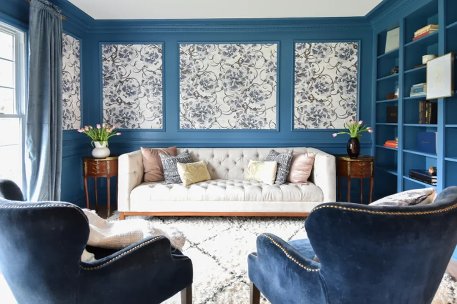
Accent Walls Remain Extremely Popular
Not everyone wants wallpaper covering every wall.
Accent walls became a popular solution.
A single light blue wallpaper wall can:
- Add color
- Create depth
- Define spaces
- Improve visual balance
Accent walls work especially well in:
- Bedrooms
- Dining rooms
- Entryways
- Offices
They create strong visual impact without dominating the room.
Light Blue Pairs Well With Many Materials
One reason light blue remains versatile is because it complements so many textures and finishes.
The color pairs nicely with:
- White oak
- Walnut wood
- Linen fabrics
- Brass accents
- Rattan furniture
- Matte black hardware
This flexibility makes decorating easier.
Homeowners do not need to redesign an entire room to make light blue work.
Wallpaper Helps Minimalist Spaces Feel Warmer
Minimalist interiors sometimes feel too plain or sterile.
Wallpaper adds texture and softness without creating clutter.
Light blue wallpaper works especially well in minimalist homes because it adds:
- Subtle color
- Dimension
- Warmth
- Personality
Even simple textured wallpaper can completely change how a room feels.
Peel-and-Stick Wallpaper Increased Popularity
Modern peel-and-stick wallpaper made decorating much easier.
Many renters avoided wallpaper in the past because removal felt difficult.
Removable wallpaper changed that.
People can now:
- Test trends
- Create temporary accent walls
- Update spaces quickly
- Avoid permanent installations
This accessibility helped wallpaper trends grow heavily online.
Social Media Influenced Wallpaper Trends
Platforms like Pinterest and Instagram accelerated interior design trends dramatically.
Light blue interiors became associated with:
- Clean aesthetics
- Cozy homes
- Scandinavian design
- Modern coastal spaces
The color photographs extremely well.
Bright, airy rooms perform strongly on social media because they feel inviting and visually calming.
That visibility helped light blue wallpaper grow even more popular.
Texture Became More Important in Modern Design
Modern interiors now focus heavily on texture.
People want rooms that feel layered instead of flat.
Wallpaper helps add:
- Softness
- Visual movement
- Depth
- Warmth
Many light blue wallpaper styles include:
- Linen-inspired finishes
- Watercolor textures
- Brushstroke effects
- Matte surfaces
These subtle details make rooms feel more refined.
Kitchens Are Using More Soft Color Tones
All-white kitchens dominated interior design for years.
That trend started shifting toward softer color palettes.
Light blue works especially well in kitchens because it complements:
- White cabinets
- Wood shelving
- Marble counters
- Brass hardware
Wallpaper can also break up large blank walls in open-concept kitchens.
Patterned light blue wallpaper adds visual interest without overwhelming the space.
Lighting Plays a Huge Role in Color Selection
Artificial lighting changes how wallpaper appears.
Warm bulbs may make light blue feel softer and slightly muted.
Cool lighting may create a crisper appearance.
Testing wallpaper samples under different lighting conditions helps avoid surprises after installation.
This step is especially important in rooms with limited natural light.
Neutral Interiors Still Need Contrast
Completely neutral rooms sometimes feel unfinished.
Light blue adds enough color to create contrast without becoming overpowering.
The shade works especially well with:
- Cream furniture
- Beige textiles
- White trim
- Natural wood flooring
This balance explains why designers continue using light blue repeatedly across different styles.
Light Blue Wallpaper Feels Timeless Instead of Trend-Driven
Some colors feel outdated quickly.
Light blue avoids that problem because it has existed in interior design for decades.
The color feels:
- Calm
- Familiar
- Flexible
- Comfortable
That timeless quality makes it safer for:
- Full-room installations
- Long-term renovations
- Permanent design updates
People want interiors that still look attractive years later.
Light Blue Wallpaper Continues Growing Because It Creates Comfortable Spaces
Modern interior design focuses heavily on comfort and atmosphere.
People want homes that feel:
- Bright
- Relaxing
- Open
- Inviting
Light blue wallpaper supports all of those goals while still adding personality and style.
The color works across:
- Coastal homes
- Minimalist interiors
- Modern apartments
- Traditional spaces
That versatility makes it one of the most reliable wallpaper choices for homeowners looking to create rooms that feel timeless, clean, and visually calming.